If only it were so simple,
to cruise through life smelling roses;
but the obstacles blacken the countryside,
and we unwittingly crush them beneath our boots.
— author unknown
Wine lovers can be forgiven if they interpret this verse to describe not the mistakes a person can make that lead to isolation, but instead a bottle of Barolo. After all, what better way to smell roses than to open a bottle of traditional Piedmontese Nebbiolo?
 If only, indeed. For those who love the classically styled wines of Piedmont, or so many other regions, there have been obstacles that blacken the wines. It is a focus on wine’s color—red wine in particular—that borders on obsession. And in that pursuit of darker and darker color comes the occasional obscuring of the roses, the elimination of the varietal character that so many consumers cherish.
The good news is that there is a transition underway. But it’s helpful to start with a basic understanding of how so many of us became so entranced with something so superficial as a wine’s color.
Wine critic Robert Parker has been celebrating opaque wines for three decades. His tasting notes for red wines regularly include a description of the wine’s color, and among top scorers, “opaque” is a common descriptor.
James Suckling was the Bordeaux critic for Wine Spectator for many years. Now working on his own, he recently explained that he sets aside 15 points out of 100 for a wine’s color. He followed up with this video in which he contends that “the best Brunellos have color.” And not light color, in case you were wondering. (He also includes the real howler that he’s heard people say it’s “impossible for Sangiovese such as a Brunello di Montalcino to be violet or ruby color.” That’s a heck of a straw man, but we digress.)
At Spectator, Suckling awarded 100 points to 17 red Bordeaux that were tasted at a young age. Combing through his tasting notes for those 17 wines, we find that 10 include references to color. All 10 of those wines are described by Suckling as being either dark or black. It’s not difficult to determine whether Suckling prefers dark color when you read tasting notes like the one he penned for the 1989 Haut Brion: “Good, dark color.” More confusing is the note he wrote for the 2006 Fontodi Flaccianello (to which he awarded 99 points): “Shows excellent color for a Sangiovese.” Does this mean that a Sangiovese’s more typical ruby color is somehow lacking? We’re left to wonder. Or, more accurately, we assume that’s the case.
On Twitter I recently asked James Suckling why, if color is so important to him, he chooses to assess color in sub-optimal lighting. After all, he explained in the Brunello video that judging color outdoors, in natural light, is the best way to truly see color in wine. But in previous videos he demonstrated how he assesses color indoors, near a flickering fire or in various lab settings. The lighting is inconsistent and, if he believes natural light is superior, he’s judging wine in sub-optimal conditions.
You might wonder: So what? What’s the difference if it only impacts a wine’s score by a point or two? I’d reply that any winemaker can tell you the difference between a wine that’s 89 points and 91 points. The market changes instantly. And imagine, public perception and selling power diminished all because a critic has junky track lights!

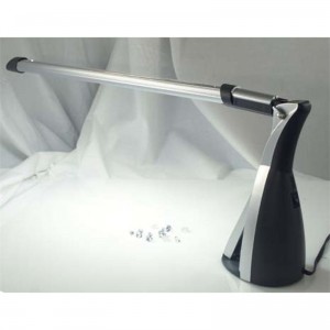
In response to Suckling’s habit of observing wine’s color in various forms of light, David Zylberberg, a wine aficionado who has worked as a geologist and geochemist, scoffed. “You can buy portable lamps with specific color temperatures and light intensity,” Zylberberg said. “They’re used for consistent evaluation of colored gemstones. Suckling should invest in one—they’re not hugely expensive—if he’s grading wines for color.”
Here’s an example of the kind of light Zylberberg is talking about: a color grading lamp for $60, or less than half the cost of one subscription to JamesSuckling.com.
But isn’t that going a little overboard? Zylberberg offered an interesting parallel as he pointed me to this article. See if this sounds like a debate about wine:
Differences in lighting will alter the way color is perceived by grader and, ultimately, customer. When lighting sources are inconsistent, it can cost dealers thousands of dollars. At the same time, tricks of the trade that enhance certain colors can cost the industry in terms of credibility.
This passage comes from a piece about evaluating gemstones. The author writes about the movement to create a lighting standard for evaluating gems, because people “in a dimly lit shack” are making color evaluations that “determine whether companies make or lose money.”
Geologists and gem lovers are much less likely to claim they can evaluate color without controlling the setting. “Daylight is much bluer than incandescent light, which is very red-shifted,” Zylberberg explained. “Not only will wines show redder in incandescent light, but redder wines will have a more vibrant color in incandescent light. Similarly, wines will show more blue or purple in daylight color temps and wines with more blue will appear more vividly colored in daylight.”
To his credit, Suckling took the time to address this question on Twitter. He told me, “I have been tasting for 29 years. I know how to judge color.” He then added, “Giving points for color works for me, UC Davis, and lots of people.”
But there is a shift underway that indicates we might want to hold off on purchasing those Diamond Color Grading lamps. It turns out not everyone thinks color deserves so much attention.
 Antonio Galloni, who recently took over the rating of California wines from Parker for The Wine Advocate, is not nearly so focused on color. And James Molesworth, who took over the rating of Bordeaux wines for Wine Spectator, almost never writes about color in red wines. A quick scan of the 20 highest scoring Châteauneuf-du-Papes from Molesworth reveals not a single mention of color.
“Color in and of itself is not a prerequisite for quality,” Molesworth told me. “There are darkly colored wines that are good, and darkly colored wines that are not good. Ditto for lightly colored wines.” (Disclosure: Molesworth wrote the foreword for my forthcoming book; I asked him to write it because I respect his approach to evaluating wines).
“Darker color is not better or worse,” Molesworth continued. “It can indicate aspects of the wine’s origin, viticulture or vinification, but that is just background context. I don’t expect Châteauneufs to be darkly colored for example, because some great ones are (like Beaucastel) and some great ones are not (like Rayas). In contrast, Argentine Malbecs are nearly all dark in color—the Malbec is thick-skinned there, due largely to the extra UV radiation from being at such extreme altitude. So, more polyphenols and anthocyanins equals more color. But that does not mean all Argentina Malbecs are great wines, simply because they are darkly colored.”
But before anyone concludes that evaluating a wine based on color is meaningless, we should answer the question: So what is color in wine telling us, anyway?
“If color has a meaning for a wine evaluator it is basically as a verification that something’s amiss,” Dan Berger, competition director and author of Dan Berger’s Vintage Experiences, told me. “When I smell a young wine and detect a small amount of oxidation, a hint of brown or a tawniness in color can verify that the wine may well have been treated inappropriately at the winery. Similarly, color can indicate maderization, which is seen in the aroma and the taste as a negative. (Except in Madeira!)”
Berger recalled a light-colored wine that recently showed beautifully.
“Recently I opened a 1968 Giuseppe Mascarello Barolo that was light in color and faintly brownish at the edges. Had this been a young wine, the color would have tipped me off to the fact that it likely was past its prime. But as a 1968, this wine was utterly fabulous. In fact, the color of this wine didn’t change much over the next 90 minutes and the aroma simply got better and better. There was almost no oxidative aroma, despite the brown rim.”
Over the past several decades, Berger has seen wine color become progressively darker, but he’s not at all convinced it’s a factor in sales. “I don’t know a single person on this planet who will be encouraged to buy a wine because it looks great,” he said. “I look at color as a kind of afterthought. You do not smell the color and you do not taste the color. And since wine is to be sniffed and sipped, I see no real need to worry about whether a wine has the ‘proper’ color.”
With more writers and critics moving their focus away from color, it seems likely that more winemakers will, too. As John Holdredge, owner and winemaker of a small eponymous operation in the Russian River Valley told me, “Why worry about color? Who cares about color?”

On a recent winter evening, my wife and I drank a Mascarello of our own. This bottle was a 2001 Giuseppe Mascarello, and our friends guessed it to be a Pinot Noir. What wine could show such power and grace without such a dense, dark color?
This wine was almost anachronistic, a reminder of the range of color Nebbiolo can yet show. Some wonderful Barolo and Barbaresco wines are dark in color. Some are lighter-shaded, structured and memorable. But there need not be this color mania that leads some to dismiss a wine before experiencing it. Swirling the Mascarello in the glass, I noticed my fingers on the other side, through the wine. I smiled. We were smelling roses, with no obstacles to blacken the countryside.
 Evan Dawson is the author of Summer in a Glass, a book about Finger Lakes winemakers. Evan is also the Finger Lakes Editor for the New York Cork Report. His paid job includes offering his best Ron Burgundy impersonation as a morning news anchor and political reporter for WHAM-TV in Rochester, NY.

